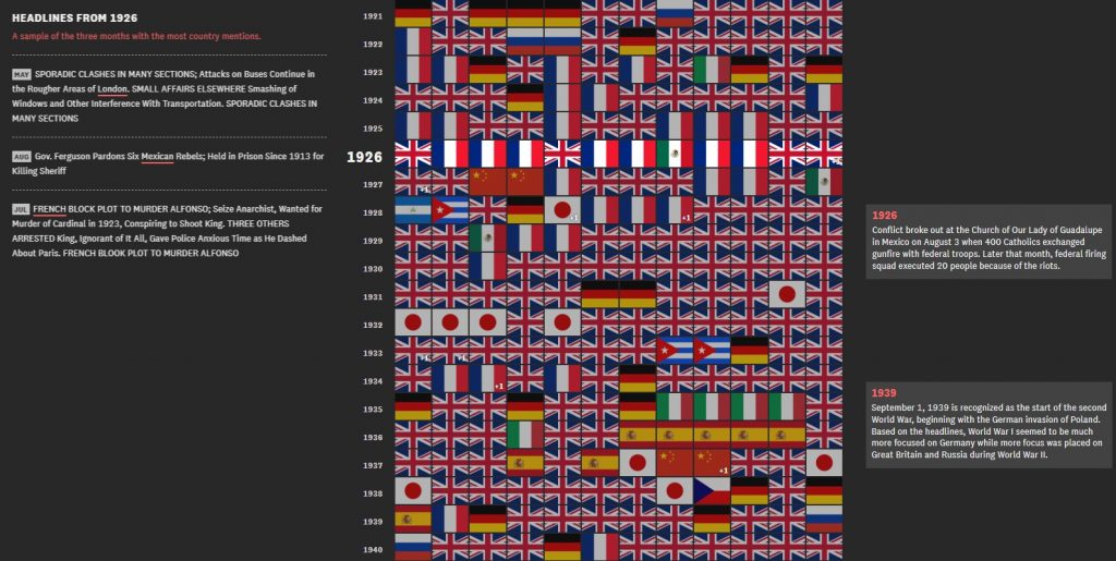
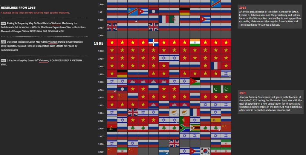
HISTORY fans have fallen in love with an amazing graphic that reveals which foreign country was of most interest to Americans every year since 1900.
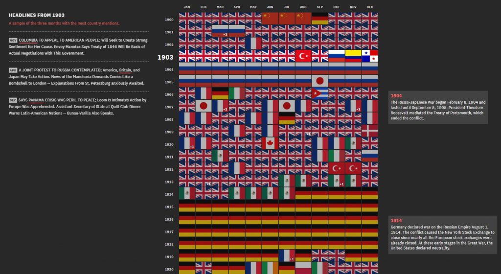
The fascinating image uses a national flag to represent which country was most written about each month by the New York Times.
The result is a remarkable snapshot of which overseas events have caught the attention of the US over the past 118 years.
The two World Wars, Vietnam, and the Cold War result in a predictable mass of German, British, and Russian flags. A Cuban flag pops up in October 1962, reflecting the threat of nuclear war, while a Rwandan flag appears in July 1994 as the horror of genocide dominated the news.
At the other end of the scale, a Canadian flag makes its one and only appearance in 1910 for reasons that remain obscure.
The graph was researched and created by The Pudding which explains ideas debated in culture with data-driven visual essays.
The Pudding have also marked out key moments in history which dominated headlines, as well as giving examples of certain headlines throughout the specific time period.
Editor of The Pudding, Russell Goldenberg who researched the chart says “this is a chart about the world through the eyes of the US.
“There is always that one country on our (US) collective conscious, and I wanted to know how that has changed over time.
“So I turned to the newspaper, since headlines have long been the catalyst for daily conversations about what is going on in the world. Most of that content is still preserved thanks to the New York Times archive.
“After looking at 741,576 section front headlines, I found out which countries around the world have preoccupied Americans the most each month since 1900.”
The graph is made up of each month on the x axis, and each year from 1900 to 2018 on the y axis.
A specific section from 1914 to 1919 dominated by the German flag as it illustrates how Germany’s influence on the First World War which engulfed news headlines.
This was put into stark contrast during the Second World War where Germany featured much less in the New York Times headlines, as the attention was shared with the UK, Russia and Japan.
Post World War Two right up to 1963 was dominated by the former Soviet Union which has been illustrated with the Russian flag as the Cold War era took precedence.
However, that changed in a drastic way as from 1965 to 1975 the Vietnam War would become the focal point for the New York Times.
Not only does this chart show the dominance of particularly countries throughout certain eras of history, but it also enables the viewer to pinpoint specific dates in history by following the flags.
For example in October 1962 the most read and talked about foreign nation was Cuba, this was down to the Cuban Missile Crisis which gripped the nation that month, and Rwanda was the most talked about nation on July 1994 following the Rwandan Genocide.
The 21st century thus far has seen two nations dominate the headlines. In the first decade Iraq was the centre of attention for the New York Times, and now in the second part of the decade the focus has shifted to China.
The graph was posted to reddit and has left many commenters fascinated by the findings.
Brenn12310 said: “I’m surprised how little Germany there is during WWII compared to how it was the top country almost every month during WWI.”
Easyj86 added: “In times where there is no large scale war or other disaster, the headlines seem to be dominated by the country which is the biggest rival at the moment. Britain, the USSR, and now China.”
Marky_Marco wrote: “This is remarkable. Kind of tells you everything you need to know.”
One commenter was intrigued to find out what particular news item made Canada the centre of attention for the only time in the impressive chart.
Stellaten said: “I wonder what was happening in Canada the one month in 1910 that Americans thought about their neighbour in the last 120 years.”

Russell from Great Barrington, Massachusetts today said that his colleagues were looking into a brief history of the New York Times when they came upon this idea.
Russell, 32, said: “My colleagues were doing a deep dive into NYT headlines to see what trends emerged each decade.
“When they showed me some early results of the data analysis, I was curious what this would look like if we honed in on countries and which ones dominated the headlines each month throughout history.”
“I don’t think there was anything too unexpected. There are also over 1400 months to comb through so you could sit with this for a while.
“I think the most interesting thing we noticed were short but captivating unexpected events that bubbled their way up to dominate a whole month or two. Things like the Haiti earthquake in 2010.”
The full interactive chart can be found on their website: https://pudding.cool/2018/12/countries/
