SCOTLAND’S other national drink is set to undergo a massive revamp – as manufacturers have unveiled a new Irn Bru design.
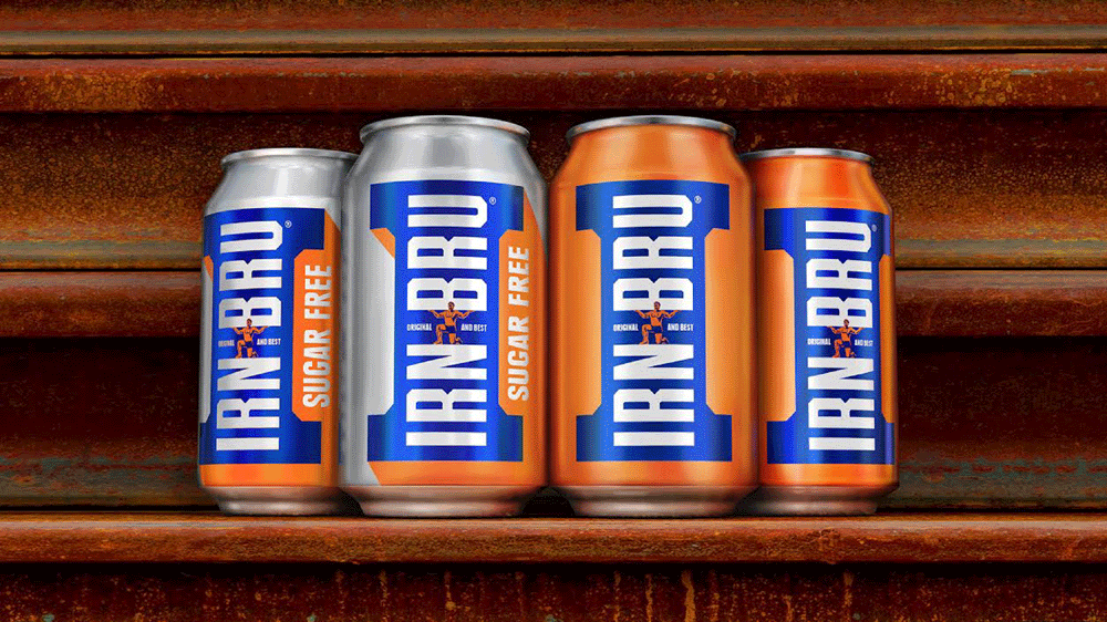
AG Barr have come up with new packaging for their popular drink, which features a prominent blue letter ‘i’ on top of a bold orange background.
The ‘i’ represents a girder and was inspired by the famous “Made From Girders” advertising campaign that the company ran in the 1980s.
The new style – created by design company Jones Knowles Ritchie (JKR) – is set to feature on cans, bottles, brand communications and external packaging, and is intended to convey a sense of strength and industrial feel.

It is the first major redesign for the brand since 2008 and will also be used on a new, sugar-free Irn-Bru offering which will be sold in a silver can.
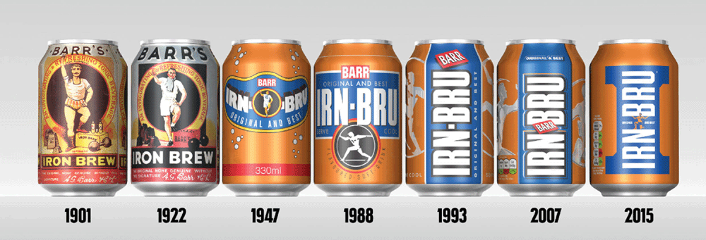
The new cans appear to be much simpler than examples from previous years, with less imagery and stylistic detail combined with bolder, simpler colours.
The Barr logo which used to feature between “Irn” and “Bru” has been replaced by an image of a muscular looking man perched between the two words.
The man represents the original strongman, Adam Brown and is a tribute to the brand’s history and image of strength.
The rest of the new can is solid orange as opposed to the previous design, which featured the silver silhouette of a person cutting through the orange colouring.

For the new sugar-free option, the orange background is changed to silver.
Adrian Troy, head of marketing at Irn Bru, said: “Girders are such a strong part of our heritage, we knew we had to have them front and centre on our packs.
“The new designs really modernise Irn Bru but stays true to our roots – Irn Bru is a brand built on strength and power.
“The packaging is iconic and stands out and ensures Irn Bru’s position as Original and Best.
“We love the new look and we’re excited to see them in stores.”
Stephen McDavid, Design Director at JKR said: “One of our main objectives was to bring the brand’s two variants – original and sugar free – closer together, creating a strong masterbrand identity.
“We also put a lot of emphasis on modernising the brand, whilst respecting its rich visual heritage.
“We worked closely with illustrator Chris Mitchell to resurrect the strong man from the original label, placing him back proudly at the centre of the brand.”
Irn-Bru was first created by the Barr family in 1900 and has been synonymous with Scottish culture for over 100 years.
This is only the eighth time that the brand has changed its look in its existence.
The secret ingredient which is key to Irn-Bru’s success is known by only three people in the world.

