CRISIS-HIT Police Scotland have been ridiculed after it was revealed they released a 40-page document of “branding guidelines” for officers.
The glossy document gives detailed instructions on everything from the right shade of blue to use in documents to how to pose for photos.
Officers are even told to ditch their body armour in photos if it looks “too bulky” and “no hunched shoulders, crossed armed or arrogant pose”.
MSP and former head of the Scottish Drug and Crime Enforcement Agency (SCDEA), Graeme Pearson, said the document was “further evidence of what is wrong with the current culture” at the force.
The branding guidelines are meant to boost the force’s image but Police Scotland is reeling over a series of rows involving excessive use of stop and search powers, officers openly carrying firearms on routine calls, an £11m funding black hole threatening frontline services, and the management style of Chief Constable Sir Stephen House.
The “Branding Guidance” document – version 1.2 dated September 2014 – was obtained under the Freedom of Information Act. The 40 pages give extremely detailed instructions on how police should maintain the force’s “brand personality”.
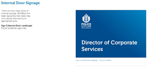
It says officers should use business card design, internal signage, logo placement, font choices and body language to help them “evoke emotions of confidence, inclusion, freedom and security”.
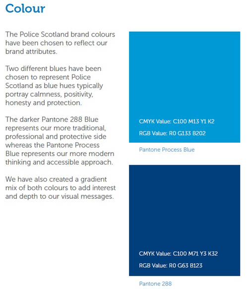
Explaining their blue colour scheme, the guide says it was chosen “as blue hues typically portray calmness, positivity, honesty and protection.”
”The darker Pantone 288 Blue represents our more traditional, professional and protective side whereas the Pantone Process Blue represents our more modern thinking and accessible approach.”
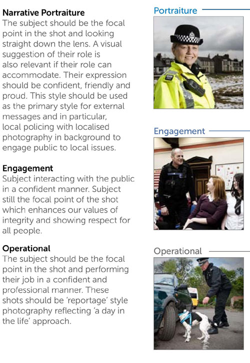
Officers are given advice on different styles of photography, such as “narrative portraiture”.
“Watch body language,” officers are told. “No hunched shoulders, crossed armed or arrogant pose. These poses do not reflect our brand values.
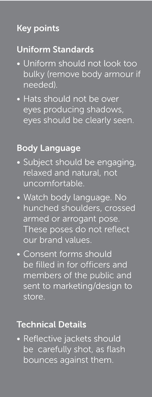
“Uniform should not look too bulky (remove body armour if needed).”
The guidance goes on to say officers should only use size 12 or 14 font, which should never be in italics or underlined, and prescribes the exact font to be used because “typography can unconsciously imply emotional content.”
It says that police should use the font Museo, which “displays clarity and transparency while still inferring forward thinking.”
The same portion of the file claims that the font’s “serif element keeps the authoritative undertones with the even weight throughout implying consistency and competence.”
There follow details on how to appropriately space the logo, saying: “Overall the approach in placing, scaling and spacing the logo, should be one of visual respect.”
Mr Pearson said of the branding guidelines: “The exercise is further evidence of what is wrong with the current culture. Officers and staff merely need to be honest and forthright in their dealings with the public and media.
“Criticisms of the Police Service arise because the force executive and the police authority have driven hard on target setting, cold numbers, budget cuts and the appearance of success.
“If both Police Scotland and the Scottish Police Authority seek the public to have confidence in them, both organisations must demonstrate greater candour in their dealings and a respect for the very people they serve – the public.”
Jonathan Isaby, Chief Executive of the Taxpayers’ Alliance, said the document showed police were “misguided in their priorities”.
He added: “Every penny of taxpayers’ money spent on the police needs to deliver on the frontline, and it’s hard to see how elaborate branding exercises achieve that.”
“The public want bobbies on the beat, not marketing consultants on a taxpayer-funded gravy train.”
When contacted for a comment a police spokesman said: “It’s entirely appropriate that an organisation such as Police Scotland has such guidelines in place.”
